Circadian methods and plots
ThereThe below methods and plots should give a good insight into your specimens circadian rhythm. If you think another method should be added please don't hesitate to contact us and we'll see what we can do.
Head to the circadian notebook for an interactive run through of everything below.
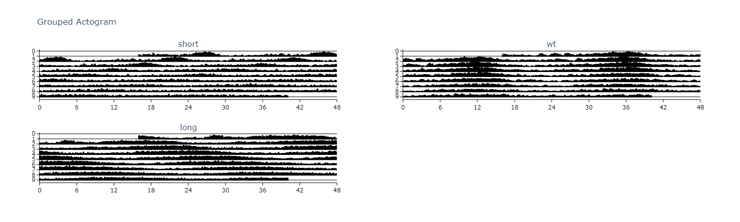
Actograms
Actograms are a rangeone of quickthe andbest easyinitial methods to quickly visualise changes in the circadianrhythm rhythmicityof including:a specimen over several days. An actogram double plots each days variable (usually movement) so you can compare each day with its previous and following day.
# Actograms.plot_actogram() can be used to plot indivdual specimens actograms or plot the average per group
# below we'll demonstrate a grouped example

fig = df.plot_actogram(
        mov_variable = 'moving',
        bin_window = 5, # the default is 5, but feel free to change it to smooth out the plot or vice versa
        facet_col = 'period_group',
        facet_arg = ['short', 'wt', 'long'],
        title = 'Grouped Actogram')

fig.show()
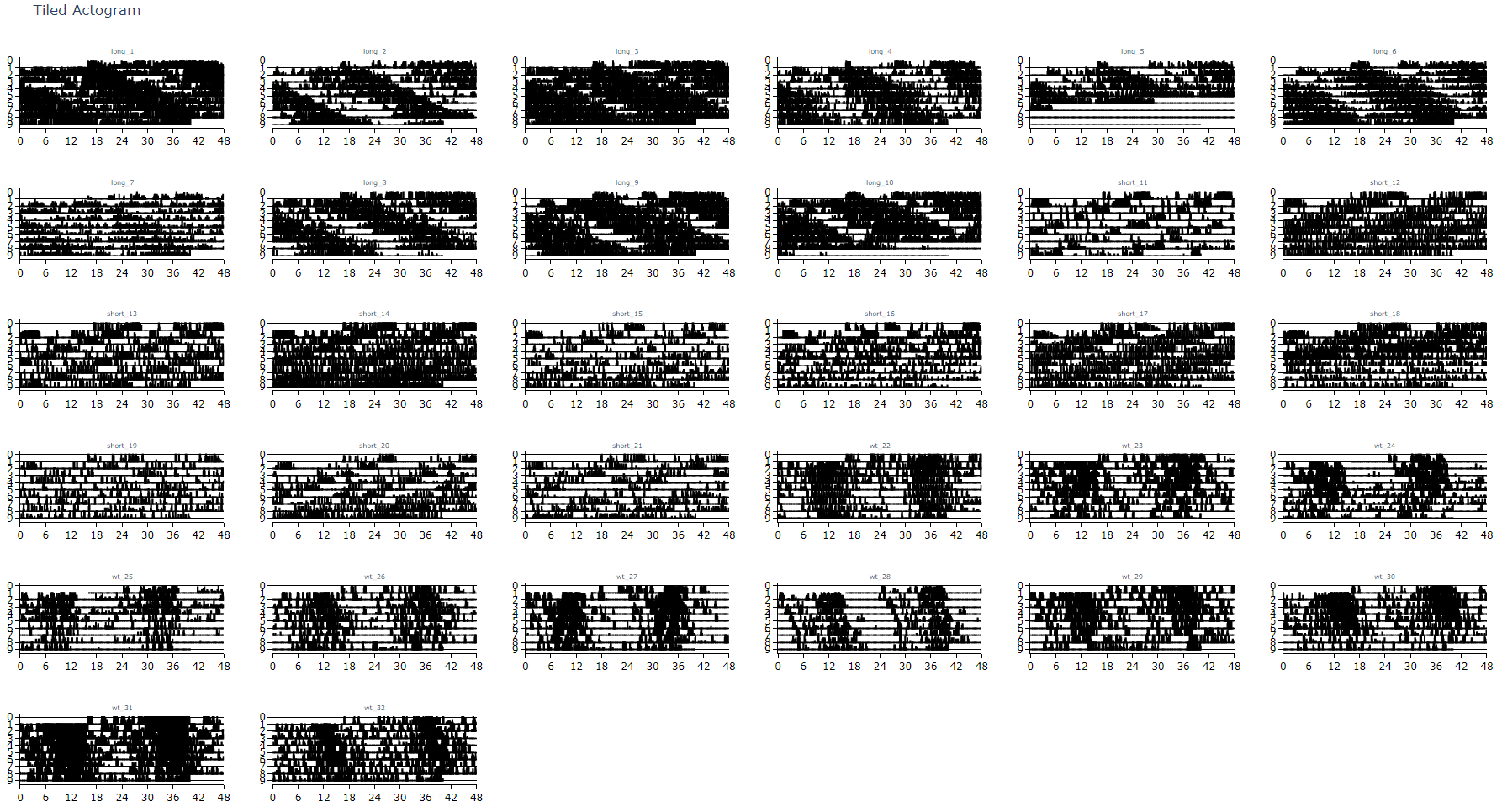
# plot_actogram_tile will plot every specimen in your behavpy dataframe
# Be careful if your dataframe has lots of flies as you'll get a very crowded plot!
fig = df.plot_actogram_tile(
        mov_variable = 'moving',
  		labels = None, # By default labels is None and will use the ID column for the labels.
  						# However if individual labels in the metadata add that column here. See the tutorial for an example
        title = 'Tiled Actogram')

fig.show()
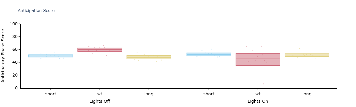
Anticipation Score
Many animals including Drosophila have peaks of activity in the morning and evening as lights turn on and off respectively. Given this daily activity the activity score
# Simply call the plot_anticipation_score() method to get a box plot of your results
# the day length and lights on/off time is 24 and 12 respectively, but these can be changed if you're augmenting the environment

fig = df.plot_anticipation_score(
        mov_variable = 'moving',
        facet_col = 'period_group',
        facet_arg = ['short', 'wt', 'long'],
        day_length = 24,
        lights_off = 12,
        title = 'Anticipation Score')

fig.show()