Periodograms
Initialising the Periodogram class
To access the methods that calculate and plot periodograms you need to initialise your data frame not as the base behavpy but as the periodogram behavpy class: etho.behavpy_periodogram()
per_df = etho.behavpy_periodogram(data, metadata, check = True)

# If you've already initialised it as a behavpy object
per_df = etho.behavpy_periodogram(df, df.meta, check = True)
Calculating Periodograms
# The below method calculates the output from a periodogram function, returning a new dataframe with information about each period in your given range
# and the power for each period
# the periodogram can only compute 4 types of periodograms currently, choose from this list ['chi_squared', 'lomb_scargle', 'fourier', 'welch']

per_chi = per_df.periodogram(
        mov_variable = 'moving',
        periodogram = 'chi_squared', # change the argument here to the other periodogram types
        period_range = [10,32], # the range in time (hours) we think the circadian frequency lies, [10,32] is the default
        sampling_rate = 15, # the time in minutes you wish to smooth the data to. This method will interpolate missing results
        alpha = 0.01 # the cutoff value for significance, i.e. 1% confidence
)

# Hint! Sometimes increasing the sampling_rate can improve you're periodograms. On average we found 15 to work best with our data, but it can be different for everyone
Plotting Periodograms
Tile Plots
To get a good understanding of each individual specimen you can use the tiled periodogram plot
# Like the actogram_tile method we can rely on the ids of each specimen or we can use labels we created
fig = per_chi.plot_periodogram_tile(
            labels = 'tile_labels',
            find_peaks = True, # make find_peaks True to add a marker over significant peaks
            title = 'Tiled Chi Squared Periodogram'
)
fig.show()
Grouped plots
Plot the average of each specimens periodograms to get a better view of the difference between experimental groups.
fig = per_chi.plot_periodogram(
            facet_col = 'period_group',
            facet_arg = ['short', 'wt', 'long'],
            title = 'Grouped Chi Squared Periodogram'
)
fig.show() 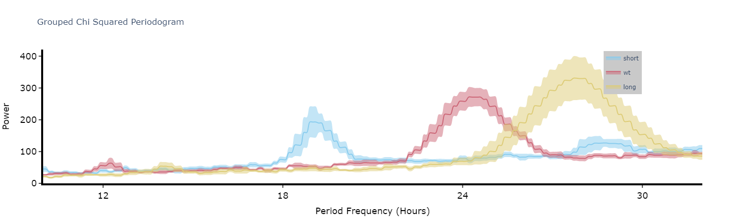
Quantifying plots
Like with the ethograms we can plot the above as quantification plot to see if what we see by eye is true statistically.
# Quantify the periodograms by finding the highest power peak and comparing it across specimens in a group
# call .quantify_periodogram() to get the results
fig, stats = per_chi.quantify_periodogram(
        facet_col = 'period_group',
        facet_arg = ['short', 'wt', 'long'],
        title = 'Quantification of Chi Squared Periodogram'
)
fig.show()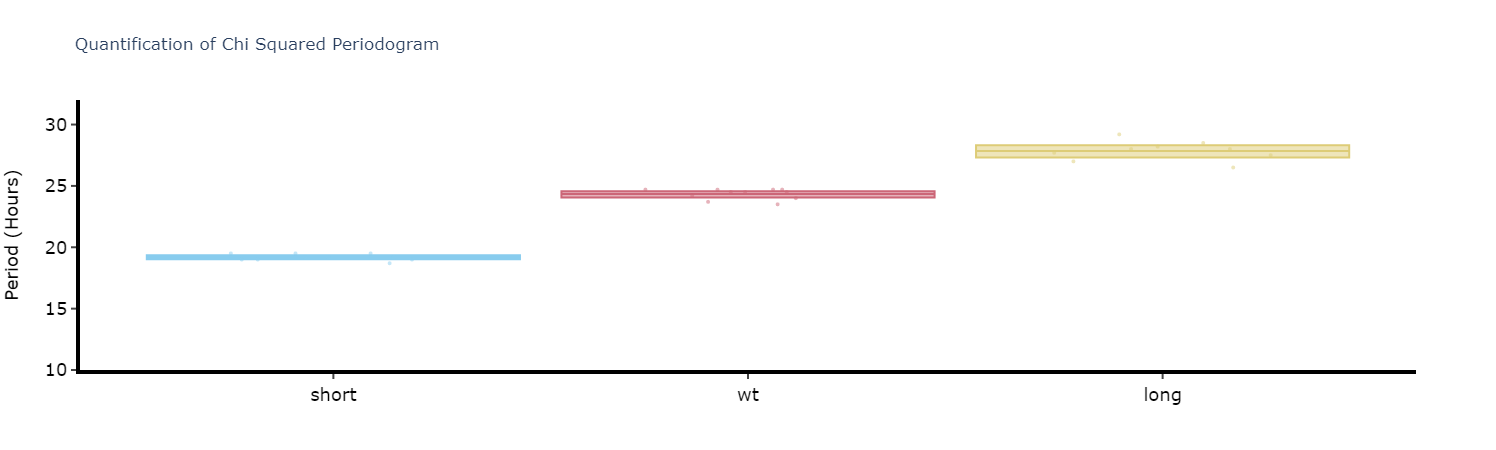
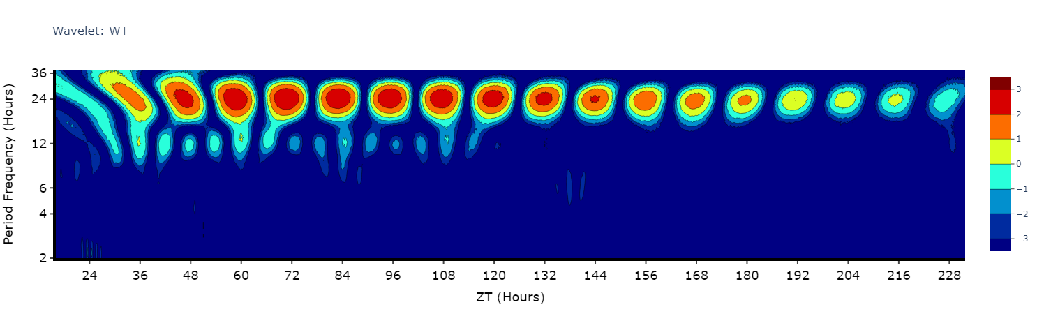
Wavelets
Wavelets are a special branch of periodograms as they are calculated in 3 dimensions rather than 2. Finding the period and power not for the whole given time, but rather broken down from the start to end. This then gives you an understanding of how rhythmicity changes over the course of your experiment, such as when you shift from LD to DD.
Wavelet plots are quite visually intensive, therefore the wavelet method will only compute and plot the average of all the data present in the data frame. Therefore, you will need to do some filtering beforehand to look at individual groups or an individual specimen.
# This method is powered bythe python package pywt, Head to https://pywavelets.readthedocs.io/en/latest/ for information about the pacakage and the other wavelet types

# filter your df prior to calling the plot
wt_df = per_df.xmv('period_group', 'wt')

fig = wt_df.wavelet(
        mov_variable = 'moving',
        sampling_rate = 15, # increasing the sampling rate will increase the resolution of lower frequencues (16-30 hours), but lose resolution of higher frequencies (2-8 hours)
        scale = 156, # the defualt is 156, increasing this number will increase the resolution of lower frequencies (and lower the high frequencies), but it will take longer to compute
        wavelet_type = 'morl', # the default wavelet type and the most commonly used in circadian analysis. Head to the website above for the other wavelet types or call the method .wavelet_types() to see their names
        title = 'Wavelet: WT'

)
fig.show()