Tutorial 1 — Overview: working with ethoscope data
Placeholder — being populatedAuto-generated fromtutorial_notebook/1_Overview_tutorial.ipynb. Executed against the seaborn canvas so every figure is inline as a static PNG. Plotly-only cells are kept for context and marked as placeholders — for the interactive version, run the source notebook.
Tutorial number 1
Working with ethoscope data
The tutorial will guide you through loading data, visualisation and plotting using the common sleep functions
1. Load the dummy dataset
import ethoscopy as etho
import pandas as pd
# This tutorial requires version 2.0.5 or greater
etho.__version__
'2.0.5'
One-time setup: fetch the tutorial datasets
The tutorial pickle files (~36 MB total, dominated by anoverview_data.pkl) are not bundled with the PyPI package, to keep pip install ethoscopy lean. Users of the ethoscope-lab Docker image can skip this cell — the pickles are already baked into the image.
Run the cell below once per environment to download them into ~/.cache/ethoscopy/tutorial_data/. Subsequent runs are idempotent.
# Idempotent: skips files that are already present.
import script.ethoscopy as etho
etho.download_tutorial_data()
Tutorial data downloaded into the user cache.
# import this function to get the tutorial dataset
from ethoscopy.misc.get_tutorials import get_tutorial
# There's some dummy data within ethoscopy for you to play with — use the function below with the argument 'overview'
# to get the data and metadata that will work with this notebook.
data, metadata = get_tutorial('overview')
# Create the behavpy object, combining your data and metadata into a linked dataframe.
# `check=True` removes metadata columns that are no longer needed post-download.
# `canvas` selects the plotting backend: 'plotly' (interactive) or 'seaborn' (static).
# For this static render we use seaborn throughout; set canvas='plotly' locally if you want the interactive version.
df = etho.behavpy(data, metadata, palette='Set2', check=True, canvas='seaborn')
dfp = etho.behavpy(data, metadata, palette='Set2', check=True, canvas='plotly')
df.canvas
'seaborn'
# Save as a pickle so subsequent sessions can skip the linking step.
df.to_pickle('./tutorial_dataframe.pkl')
# Load back with pandas — `df` is a behavpy subclass of DataFrame so pickling round-trips natively.
df = pd.read_pickle('./tutorial_dataframe.pkl')
# Display an excerpt of both metadata and data together
df.display()
(Metadata table: 39 specimens × 7 columns, Data table: 327031 rows × 16 columns. Full listing elided in the docs — run the notebook locally to view.)
# Or just the metadata
df.meta
# Summary statistics of the whole experiment
df.summary()
behavpy table with:
    individuals       39
   metavariable        7
      variables       16
   measurements   327031
# Detailed per-specimen data points / time range
df.summary(detailed=True)
(Detailed per-specimen table — each individual has ~9600 data points spanning t = 31140 → 608340. Elided in the docs.)
2. Curate the data
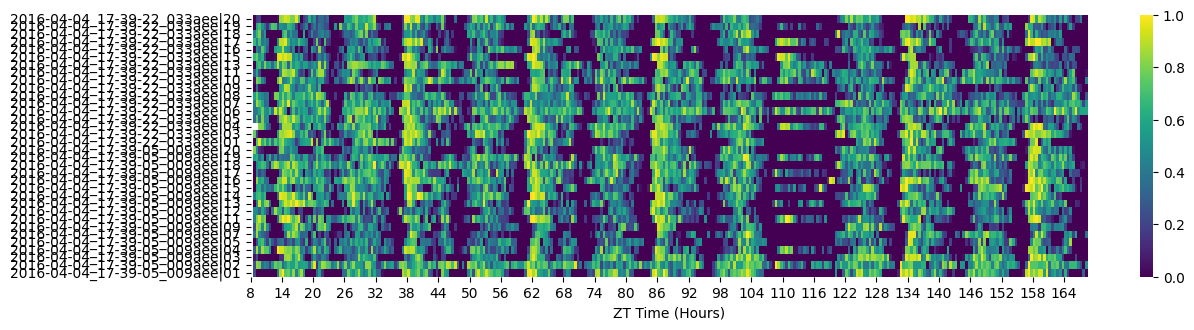
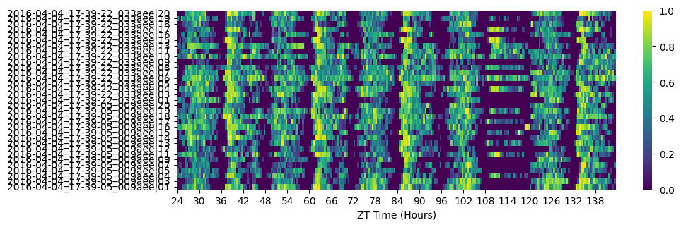
# Heatmaps give a quick overview and make dead/abnormal specimens obvious.
fig = df.heatmap(variable='asleep');
# Remove specimens that stopped moving for an extended period ("dead").
# Data before their death is retained.
df = df.curate_dead_animals()
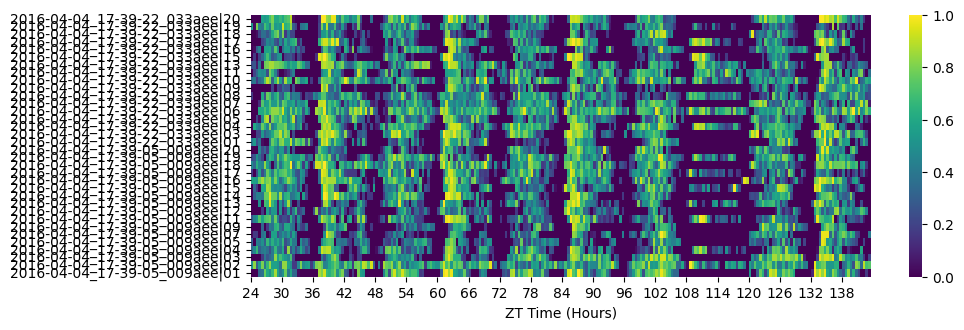
# Filter by time — cut the fragmentary first half-day and anything after the experimental window.
df = df.t_filter(start_time=24, end_time=144)
# Re-heatmap to see the effect
fig = df.heatmap(variable='asleep')
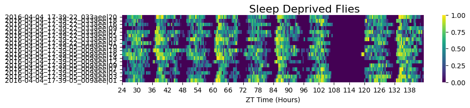
# Sleep-deprived subgroup
fig = df.xmv('sleep_deprived', True).heatmap(variable='asleep', title='Sleep Deprived Flies')
# Non-sleep-deprived subgroup
fig = df.xmv('sleep_deprived', False).heatmap(variable='asleep', title='Non-Sleep Deprived Flies')
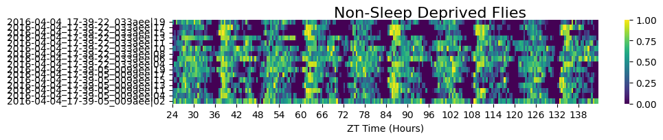
# There's still one specimen in the control group that looks abnormal — almost always asleep,
# but not caught by curate_dead_animals(). Remove it explicitly after zooming in to get its id.
df = df.remove('id', '2016-04-04_17-39-05_009aee|02')

fig = df.heatmap(variable='asleep')
3. Visualise and save the sleep data
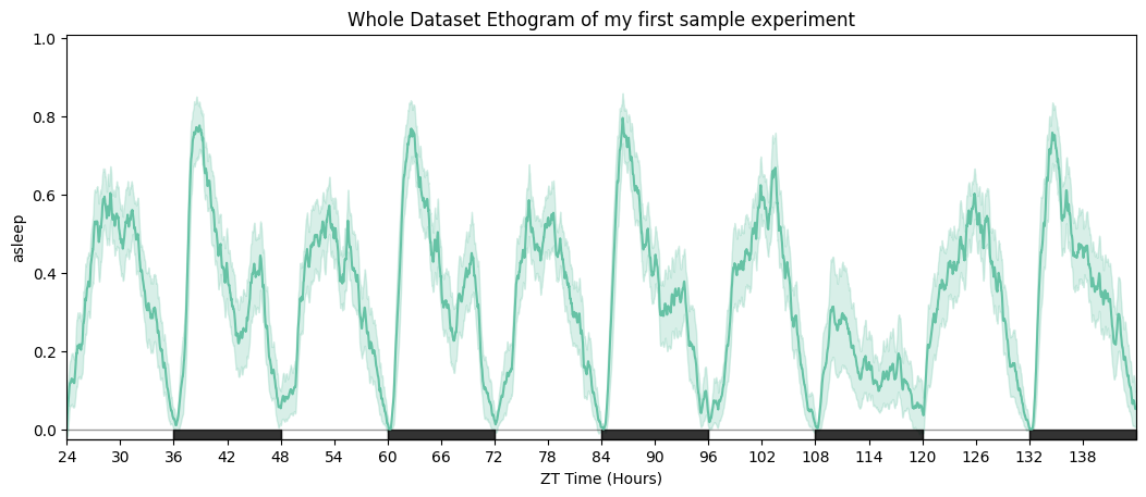
# Ethogram of the whole dataset — solid line = mean, shaded area = 95% CI.
fig = df.plot_overtime(variable='asleep', title='Whole Dataset Ethogram')
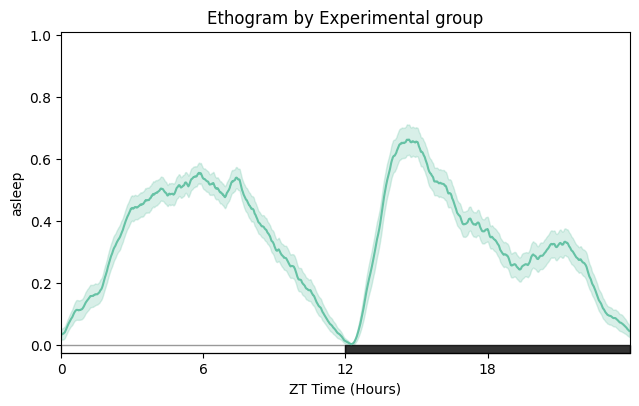
# Wrapped over a day to emphasise the circadian structure.
fig = df.plot_overtime(variable='asleep', wrapped=True, title='Ethogram — wrapped daily')
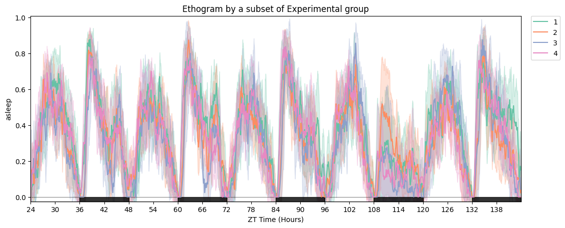
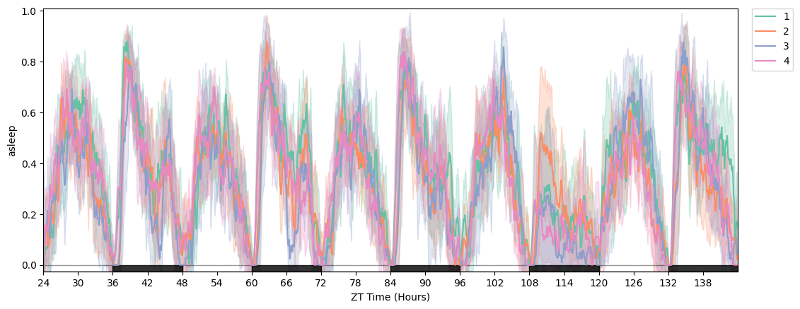
# Split by experimental group.
fig = df.plot_overtime(variable='asleep', facet_col='exp_group', title='Ethogram by experimental group')
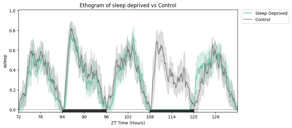
# Focus on the rebound window and relabel the legend.
zoomin_df = df.t_filter(start_time=72, end_time=132)
fig = zoomin_df.plot_overtime(
    variable='asleep',
    facet_col='sleep_deprived', facet_arg=[True, False],
    facet_labels=['Sleep Deprived', 'Control'],
    title='Sleep deprived vs control',
)
# Plotly-only: make_tile arranges multiple overtime plots in subplots.
from functools import partial

fig_fun = partial(
    dfp.plot_overtime, variable='asleep',
    facet_col='sleep_deprived', facet_arg=[True, False],
    facet_labels=['Sleep Deprived', 'Control'],
)
fig = dfp.make_tile(facet_tile='exp_group', plot_fun=fig_fun)
fig.show()
(Plotly figure — run the notebook locally for the interactive version.)
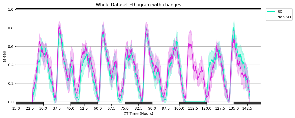
# Additional plot_overtime parameters: smoothing window, custom day_length / lights_off, gridlines, and a custom colour list.
fig = df.plot_overtime(
    variable='asleep',
    facet_col='sleep_deprived', facet_arg=[True, False],
    facet_labels=['SD', 'Non SD'],
    title='Whole Dataset Ethogram with tweaks',
    avg_window=60, day_length=30, lights_off=15, grids=True,
    col_list=['#0eeebe', '#d824db'],
)
# Same plot, but Plotly — deselect legend items in the browser to declutter.
fig = dfp.plot_overtime(
    variable='asleep',
    facet_col='sleep_deprived', facet_arg=[True, False],
    facet_labels=['SD', 'Non SD'],
    title='Whole Dataset Ethogram — Plotly',
    avg_window=60, day_length=30, lights_off=15, grids=True,
    col_list=['#0eeebe', '#d824db'],
)
fig.show()
(Plotly figure — run the notebook locally for the interactive version.)
# Saving figures: HTML (keeps Plotly interactivity), PDF or PNG (static, any canvas).
fig = df.plot_overtime(variable='asleep', facet_col='exp_group')
df.save_figure(fig, './tutorial_plot.pdf', width=1500, height=1500)
df.save_figure(fig, './tutorial_plot.png', width=2000, height=1500)
Saved to ./tutorial_plot.pdf
Saved to ./tutorial_plot.png
# plot_quantify — returns (fig, stats_df). Useful both for the figure and for the raw per-specimen values.
temp_df = df.t_filter(start_time=24, end_time=96)
fig, stats_quant = temp_df.plot_quantify(
    variable='asleep',
    facet_col='sleep_deprived', facet_arg=[True, False],
    facet_labels=['Sleep Deprived', 'Control'],
    title='Quantification of baseline sleep',
)
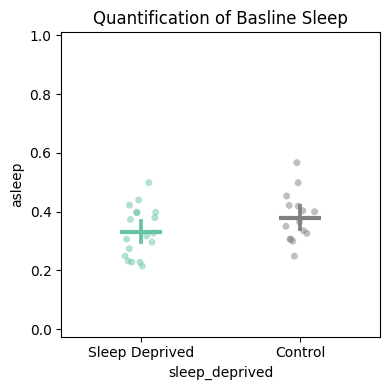
# The returned stats dataframe carries the per-specimen means and group label,
# ready for downstream statistical analysis.
stats_quant.head()
4. Quantify and compare
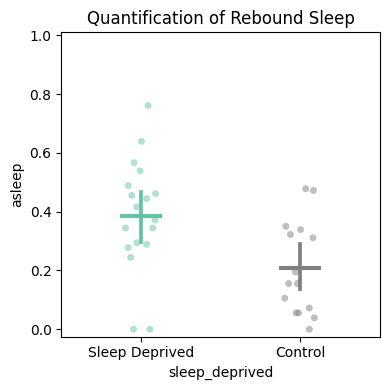
# Rebound sleep — 3-hour window after the deprivation ends.
temp_df = df.t_filter(start_time=120, end_time=123)
fig, stats_deprivation = temp_df.plot_quantify(
    variable='asleep',
    facet_col='sleep_deprived', facet_arg=[True, False],
    facet_labels=['Sleep Deprived', 'Control'],
    title='Quantification of rebound sleep',
)
# Plotly version applies z-score filtering (>3 std removed) by default.
temp_df = dfp.t_filter(start_time=120, end_time=123)
fig, stats_deprivation = temp_df.plot_quantify(
    variable='asleep',
    facet_col='sleep_deprived', facet_arg=[True, False],
    facet_labels=['Sleep Deprived', 'Control'],
    z_score=True,
    title='Quantification of rebound sleep',
)
fig.show()
(Plotly figure — run the notebook locally for the interactive version.)
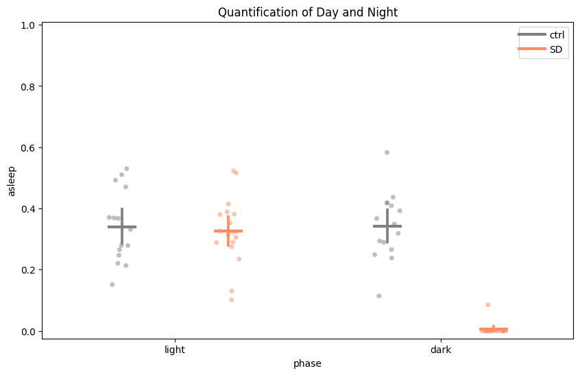
# Day / night split for the same window.
temp_df = df.t_filter(start_time=96, end_time=120)
fig, stats_day_night = temp_df.plot_day_night(
    variable='asleep',
    facet_col='sleep_deprived', facet_labels=['ctrl', 'SD'],
    title='Quantification of day and night',
)
# plot_compare_variables — two-y-axis plot comparing multiple variables. Plotly-only.
temp_df = dfp.t_filter(start_time=24, end_time=96)
fig, stats_multiple = temp_df.plot_compare_variables(
    variables=['micro', 'walk', 'max_velocity'],
    facet_col='sleep_deprived', facet_arg=[True, False],
    facet_labels=['Sleep Deprived', 'Control'],
    title='Micromovements vs walking',
)
fig.show()
(Plotly figure — run the notebook locally for the interactive version.)
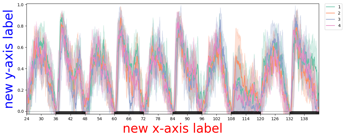
5. Editing the figure object before display
The fig returned by every plotting method is the native matplotlib/Axes (seaborn canvas) or Plotly figure object, so you can tweak anything before showing or saving.
# Seaborn canvas — matplotlib API.
plotter = df
fig = plotter.plot_overtime(variable='asleep', facet_col='exp_group')
fig.axes[0].set_xlabel('new x-axis label', color='red', fontsize=30)
fig.axes[0].set_ylabel('new y-axis label', color='blue', fontsize=30)
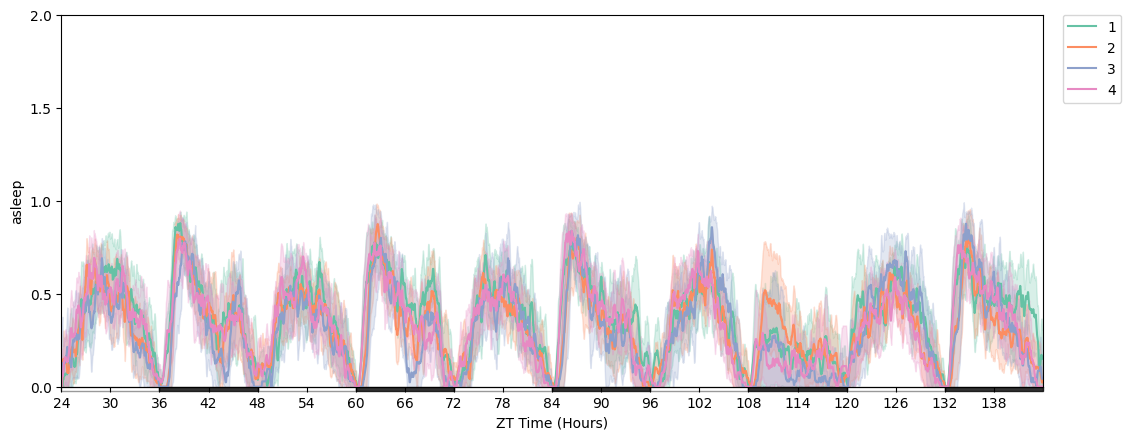
# Change y-axis range and tick positions.
import numpy as np

plotter = df
fig = plotter.plot_overtime(variable='asleep', facet_col='exp_group')
fig.axes[0].set_ylim([0, 2])
fig.axes[0].yaxis.set_ticks(np.arange(0, 2.1, 0.5))
6. Exporting the notebook for publications
Notebooks double as a record of the analysis. Export this entire notebook as HTML to share code + figures without a Python install on the reader's side:
File → Save and Export Notebook As → HTML
Or, if you want a static version that lives alongside the documentation, the same nbconvert --execute --to markdown pipeline used to generate this page does the job.