Visualising mAGO data
OnceWithin the behavpyGilestro objectlab we have special adaptations to the ethoscope which includes the mAGO, a module that can sleep deprive flies manually and also deliver a puff of an odour of choice after periods of rest. See the documentation here: ethoscope_mAGO.
If you've performed a mAGO experiment then the data needs to be loaded in with the function puff_mago() which decides if a fly has responded if it's moved with the time limit post puff (default is created,10 seconds).
Quantify response
The method .plot_response_quantify() will produce a plot of the printmean functionresponse rate per group. Within the software for delivering a puff it can be set to have a random chance of occurring. I.e. if it's set to 50%, and the immobility criteria is met then the chance a puff will be delivered is 50/50. This gives us two sets of data, true response rate and the underlying likelihood a fly will just showrandomly yourmove, datawhich structure.is Ifcalled youhere wantSpontaneous toMovement see(Spon. yourMov).
.display()# firstThe load your data and create a behavpy instance of it
df.display()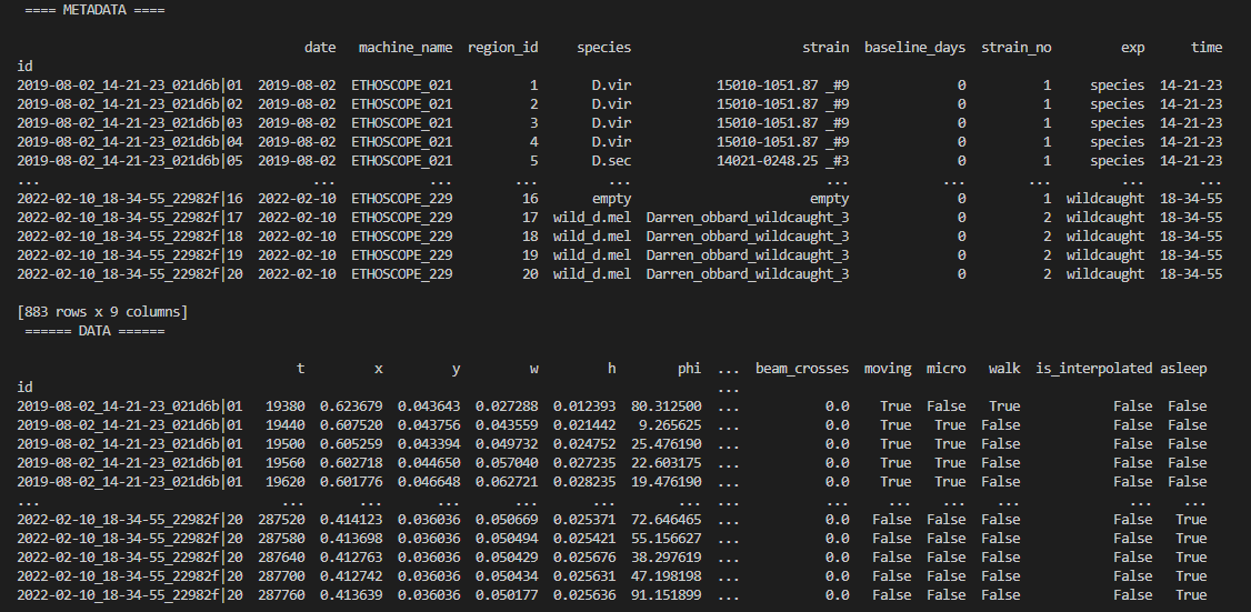
You can also get quick summary statistics of your dataset with .summary()
df.summary()

# an example output of df.summary()
output:
behavpy table with:
    individuals       675
   metavariable         9
      variables        13
   measurements   3370075

# add the argument detailed = True to get information per fly
df.summary(detailed = True)

output:
                               data_points          time_range
id
2019-08-02_14-21-23_021d6b|01         5756   86400  ->  431940
2019-08-02_14-21-23_021d6b|02         5481   86400  ->  431940
Be careful with the pandas method .groupby() as this will return a pandas object back and not a behavpy object. Mostparameters other commonthan pandasresponse_col actions will return a behavpy object.
Visualising your data
Whilst summary statistics are good for a basic overview, visualising the variable of interest over time is usually a lot more informative.
Heatmaps
The first port of call when looking at time series data is to create a heatmap to see if there are any obvious irregularities in your experiments.
# To create a heatmap all you need to write is one line of code!
# All plot methods will return the figure, the usual etiquette is to save the variable as fig

fig = df.heatmap('moving') # enter as a string (which ever numerical variable you want plotted inside the brackets

# Then all you need to do is the belowcolumn to generateof the figureresponse fig.show()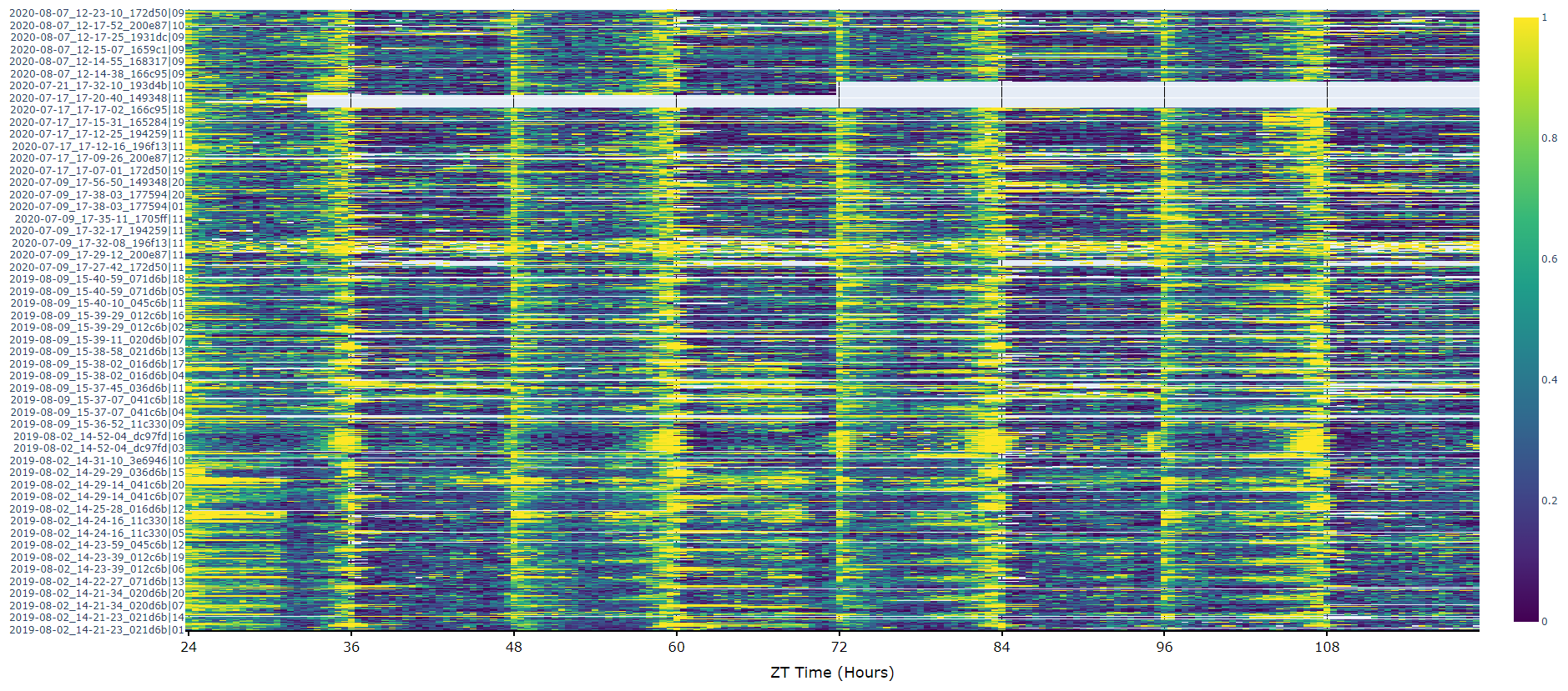
Plots over time
For an aggregate view of your variable of interest over time, use the .plot_overtime() method to visualise the mean variable over your given time frame or split it into sub groups using the information in your metadata.
# If wrapped is True each specimens data will be aggregated to one 24 day before being aggregated as a whole. If you want to view each day seperately, keep wrapped False.
# To achieve the smooth plot a moving average is applied, we found averaging over 30 minutes gave the best results
# So if you have your data in rows of 10 seconds you would want the avg_window to be 180 (the default)
# Here the data is rows of 60 seconds, so we only need 30

fig = df.plot_overtime(
variable = 'moving',
wrapped = True,
avg_window = 30
)
fig.show()
# the plots will show the mean with 95% confidence intervals in a lighter colour around the mean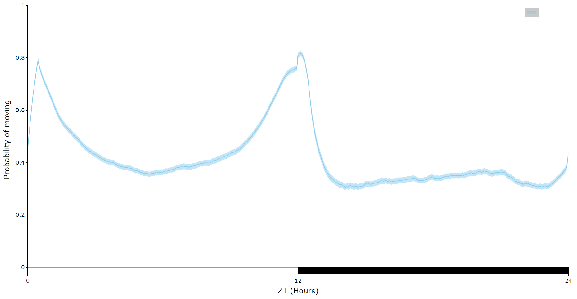
# You can seperate out your plots by your specimen labels in the metadata. Specify which column you want fromn the metadata with facet_col and then specify which groups you want with facet_args
# What you enter for facet_args must be in a list and be exactly what is in that column in the metadata
# Don't like the label names in the column, rename the graphing labels with the facet_labels parameter. This can only be done if you have a same length list for facet_arg. Also make sure theypuff) are the same orderas figother quantify methods

fig, stats = df.plot_overtime(plot_response_quantify(
variableresonse_col = 'moving'has_responded',
facet_col = 'species',
facet_arg = ['D.vir', 'D.ere', 'D.wil', 'D.sec', 'D.yak'],
facet_labels = ['D.virilis', 'D.erecta', 'D.willistoni', 'D.sechellia', 'D.yakuba']
)
fig.show()
Quantify response overtime
You can also view how the response rate changes over time with .plot_response_overtime(). For this metho you'll need to load in the normal dataset, i.e. with motion_detector or sleep_annotation as the method needs to know at what point the puff occured. The plot is per minute, so it's best to load it in with a time window of 60. If you have it higher the method won't work.
# Call the method on the normal behavpy table with the first argument the puff behavpy table
# The seconds argument decides if you're doinglooking circadianat experimentsruns of inactivty or activity,
# if you set the puff chance low enough you can specifyprobe whenactivity night begins with the parameter circadian_night to change the phase bars at the bottom. E.g. circadian_night = 18 for lights off at ZT 18.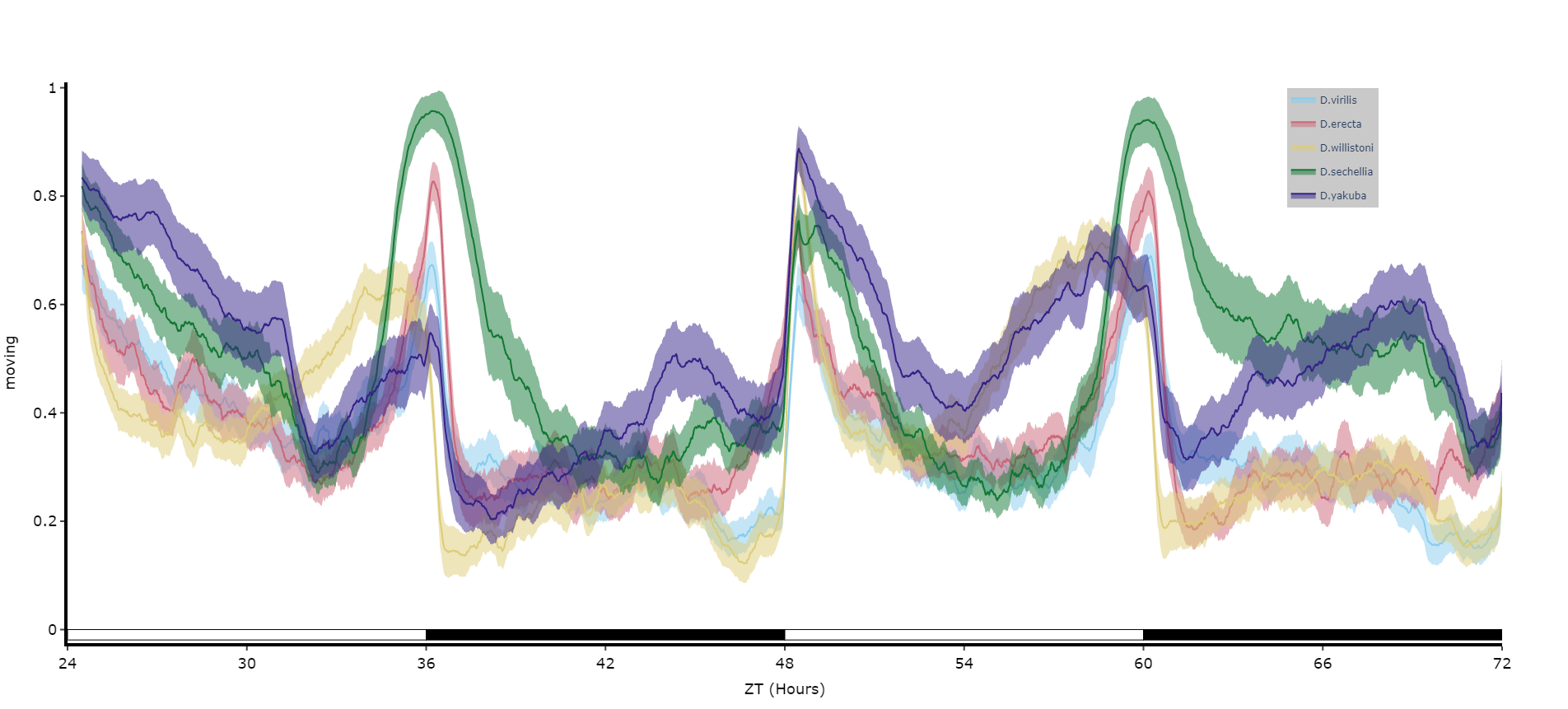
Quantifying sleep
The plots above look nice, but we often want to quantify the differences to prove what our eyes are telling us. The method .plot_quantify() plots the mean and 95% CI of the specimens to give a strong visual indication of group differences.
# Quantify parameters are near identical to .plot_overtime()
# For all plotting methods in behavpy we can add grid lines to better view the data and you can also add a title, see below for how
# All quantifying plots sill return two objects, the first will be the plotly figure as normal and the second a pandas dataframe with
# the calculated avergages per specimen for you to perform statistics on. You can do this via the common statistical package scipy or
# we recommend a new package DABEST, that produces non p-value related statisics and visualtion too.
# We'll be looking to add DABEST into our ecosytem soon too!too

fig, stats = df.plot_quantify(plot_response_overtime(
variableresponse_df = puff_df,
activity = 'moving'inactive',
facet_col = 'species',
facet_arg = ['D.vir', 'D.ere', 'D.wil', 'D.sec', 'D.yak']
title = 'This is a plot for quantifying',
grids = True
)
fig.show()

# Tip! You can have a facet_col argument and nothing for facet_args and the method will automatically plot all groups within that column. Careful though as the order/colour might not be preserved in similar but different plots
Quantify day and night
Often you'll want to compare a variable between the day and night, particularly total sleep. This variation of .plot_quantify() will plot the mean and 96% CI of a variable for a user defined day and night.
# Quantify parameters are near identical to .plot_quantify() with the addtion of day_length and lights_off which takes (in hours) how long the day is for the specimen (defaults 24) and at what point within that day the lights turn off (night, defaults 12)

fig, stats = df.plot_day_night(
variable = 'asleep',
facet_col = 'species',
facet_arg = ['D.vir', 'D.ere', 'D.wil', 'D.sec', 'D.yak'],
facet_labels = ['D.virilis', 'D.erecta', 'D.willistoni', 'D.sechellia', 'D.yakuba'],
day_length = 24,
lights_off = 12
)
fig.show()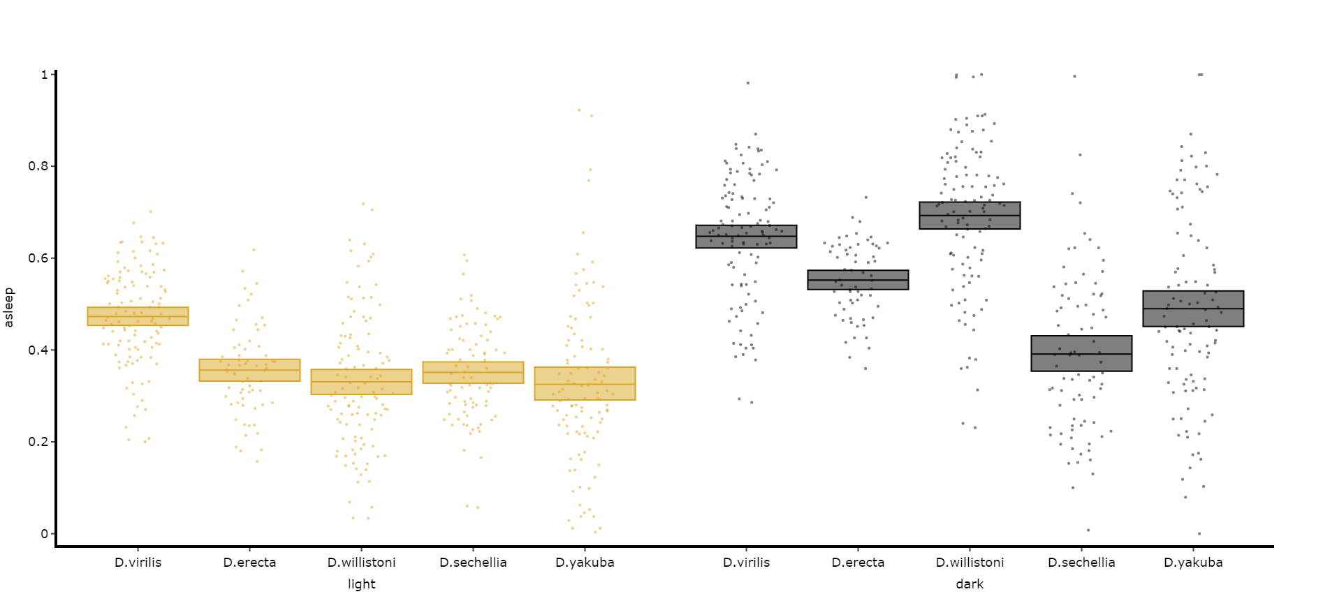
Compare variables
You may sometimes want to compare different but similar variables from your experiment, often comparing them across different experimental groups. Use .plot_compare_variables() to compare up to 24 different variables (we run out of colours after that...).
# Like the others it takes the regualar arguments. However, rather than the variable parameter it's variables, which takes a list of strings of the different columns you want to compare. The final variable in the list will have it's own y-axis on the right-hand side, so save this one for different scales.

# The most often use of this with the ethoscope data is to compare micro movements to walking movements to better understand the locomotion of the specimen, so lets look at that.

fig, stats = df.plot_compare_variables(
    variables = ['mirco', 'walk']
    facet_col = 'species',
    facet_arg = ['D.vir', 'D.ere', 'D.wil', 'D.sec', 'D.yak'],
    facet_labels = ['D.virilis', 'D.erecta', 'D.willistoni', 'D.sechellia', 'D.yakuba']
)
fig.show()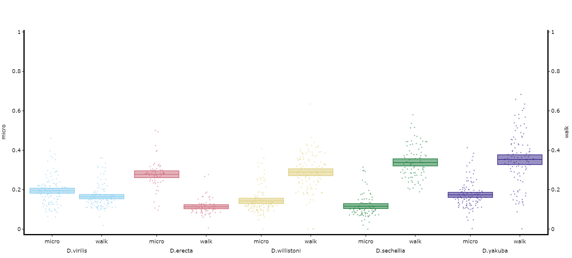
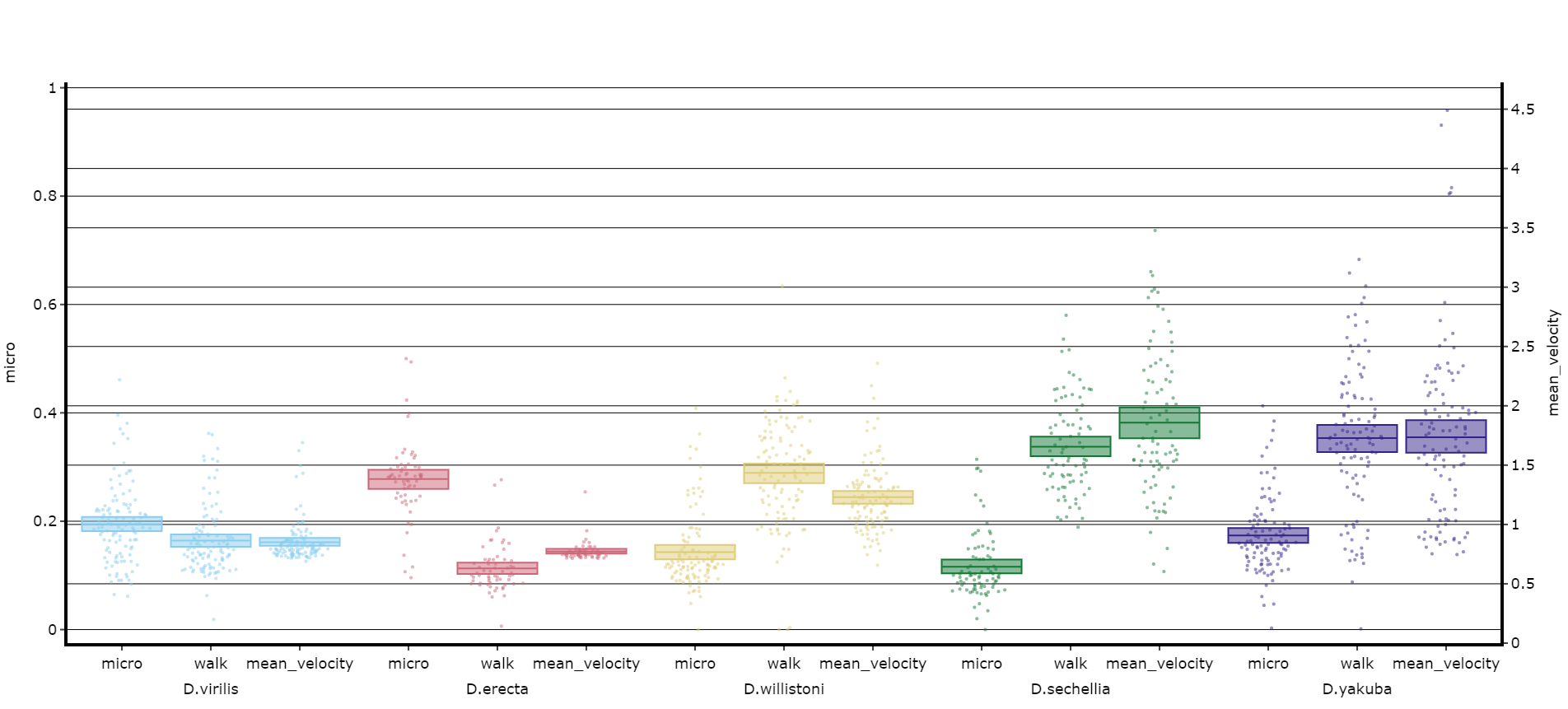
# Lets add the velocity of the specimen to see how it looks with different scales.

fig, stats = df.plot_compare_variables(
    variables = ['mirco', 'walk', 'mean_velocity']
    facet_col = 'species',
    facet_arg = ['D.vir', 'D.ere', 'D.wil', 'D.sec', 'D.yak', 'D.sims'],
    facet_labels = ['D.virilis', 'D.erecta', 'D.willistoni', 'D.sechellia', 'D.yakuba', 'D.Simulans'],
    # Add grids to the plot so we can better see how the plots align
    grids = True
)
fig.show()
Head to the Overview Tutorial for interactive examples of some of these plots. It also shows you how to edit the fig object after it's been generated if you wish to change things like axis titles and axis range.
Saving plots
As seen above all plot methods will produce a figure structure that you use .show() to generate the plot. To save these plots all we need to do is place the fig object inside a behavpy function called etho.save_figure()
You can save your plots as PDFs, SVGs, JPEGs or PNGS. It's recommended you save it as either a pdf or svg for the best quality and then the ability to alter then later.
You can also save the plot as a html file. Html files retain the interactive nature of the plotly plots. This comes in most useful when using jupyter notebooks and you want to see your plot full screen, rather than just plotted under the cell.
# simply have you returned fig as the argument alongside its save path and name to save

# remember to change the file type at the end of path as you want it
# you can set the width and height of the saved image with the parameters width and height (this has no effect for .html files)
etho.save_figure(fig, './tutorial_fig.pdf', width = 1500, height = 1000)