Visualising mAGO data
Within the Gilestro lab we have special adaptations to the ethoscope which includes the mAGO, a module that can sleep deprive flies manually and also deliver a puff of an odour of choice after periods of rest. See the documentation here: ethoscope_mAGO.
If you've performed a mAGO experiment then the data needs to be loaded in with the function puff_mago() which decides if a fly has responded if it's moved with the time limit post puff (default is 10 seconds).
Quantify response
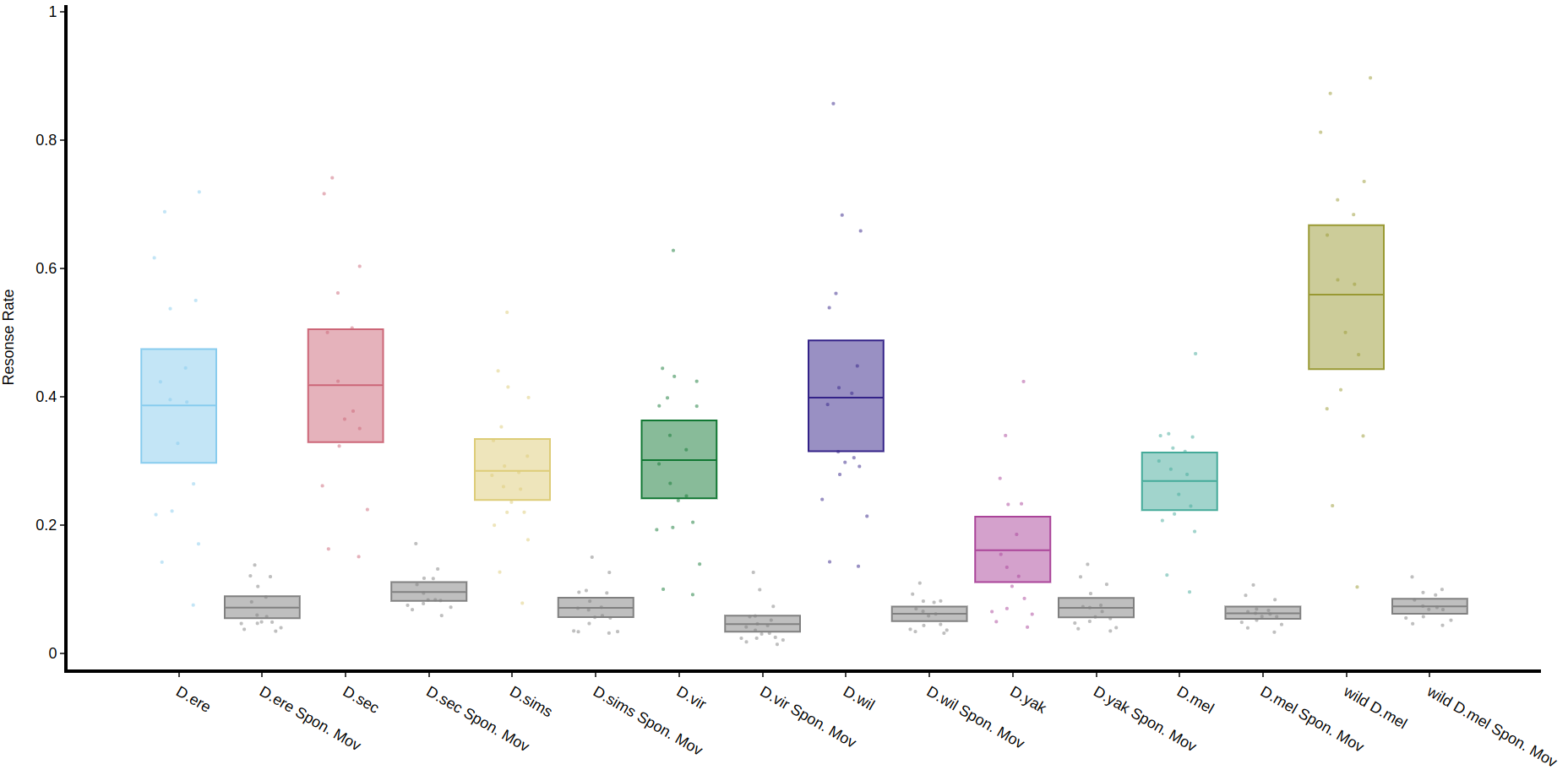
The method .plot_response_quantify() will produce a plot of the mean response rate per group. Within the software for delivering a puff it can be set to have a random chance of occurring. I.e. if it's set to 50%, and the immobility criteria is met then the chance a puff will be delivered is 50/50. This gives us two sets of data, true response rate and the underlying likelihood a fly will just randomly move, which is called here Spontaneous Movement (Spon. Mov).
# The parameters other than response_col (which is the column of the response per puff) are the same as other quantify methods

fig, stats = df.plot_response_quantify(
resonse_col = 'has_responded',
facet_col = 'species',
)
fig.show()
Quantify response overtime
You can also view how the response rate changes over time with .plot_response_overtime(). For this methomethod you'll need to load in the normal dataset, i.e. with motion_detector or sleep_annotation as the method needs to know at what point the puff occured.occurred. The plot is per minute, so it's best to load it in with a time window of 60. If you have it higher the method won't work.
# Call the method on the normal behavpy table with the first argument the puff behavpy table
# The seconds argument decides if you're looking at runs of inactivty or activity,
# if you set the puff chance low enough you can probe activity too

fig, stats = df.plot_response_overtime(
response_df = puff_df,
activity = 'inactive',
facet_col = 'species'
)
fig.show()
