Visualising with the HMM
The best way to get to grips with your newly trained HMM is to decode some data and has a look at it visually.
Single plots
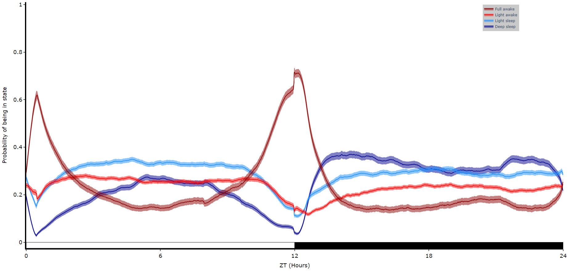
# Like plot_overtime() this method will take a single variable and trained hmm, and plot them over time.
# If you're using behavpy_HMM to look at sleep using the 4 state structure you don't have to specify labels and colours, as they are pre written. However, if you aren't please specify.

# use below to open your saved trained hmmlearn object
with open('/Users/trained_hmms/4_states_hmm.pkl', 'rb') as file:
    h = pickle.load(file)

fig = df.plot_hmm_overtime(
hmm = h,
variable = 'moving',
labels = ['Deep sleep', 'Light sleep', 'Light awake', 'Full awake'],
# colours = ['blue', 'green', 'yellow', 'red'], # example colours
wrapped = True,
bin = 60
)
fig.show()

# You cannot facet using this method, see the next plot for faceting
Faceted plots
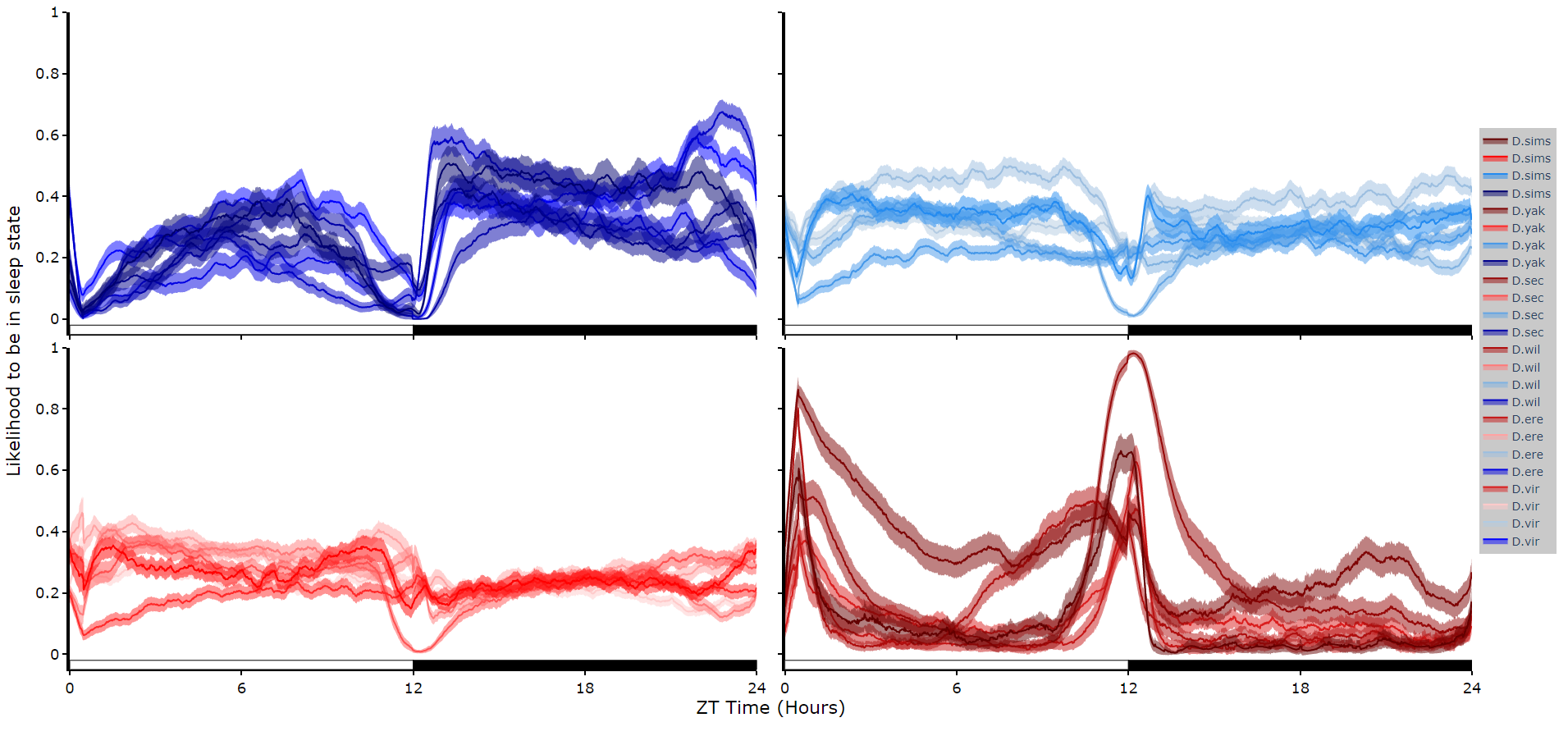
To reduce clutter when faceting the plot will become a group of subplots, with each subplot the collective plots of each specimen for each hidden state.
This method only works for 4 hidden states structures.
# plot_hmm_split works just like above, however you need to specify the column to facet by. You can also specify the arguments if you don't want all the groups from the facet column

fig = df.plot_hmm_split(
    hmm = h,
    variable = 'moving',
    facet_col = 'species',
    wrapped = True,
    bin = 60
)
fig.show()
# You don't always want to decode every group with the same hmm. In fact with different species, mutants,
# subgroups you should be training a fresh hmm
# if you pass a list to the hmm parameter the same length as the
# facet_arg argument the method will apply the right hmm to each group
fig = df.plot_hmm_split(
hmm = [hv, he, hw, hs, hy],
variable = 'moving',
facet_labels = ['D.virilis', 'D.erecta', 'D.willistoni', 'D.sechellia', 'D.yakuba']
facet_col = 'species',
facet_arg = ['D.vir', 'D.ere', 'D.wil', 'D.sec', 'D.yak'],
wrapped = True,
bin = [60, 60, 60, 60, 60]
)
fig.show()
Quantify time in each state
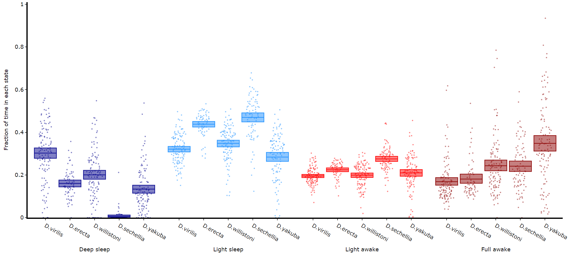
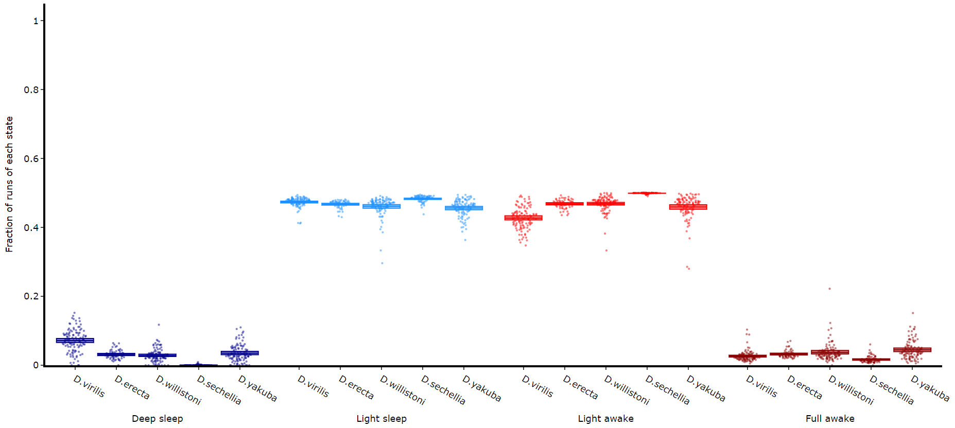
# Like plot_quantify() this method will quantify how much of the time each specimen is within each state.


fig = df.plot_hmm_quantify(
    hmm = [hv, he, hw, hs, hy],
    variable = 'moving',
    facet_labels = ['D.virilis', 'D.erecta', 'D.willistoni', 'D.sechellia', 'D.yakuba']
    facet_col = 'species',
    facet_arg = ['D.vir', 'D.ere', 'D.wil', 'D.sec', 'D.yak'],
    bin = [60, 60, 60, 60, 60]
)
fig.show()
Quantifying length of each state
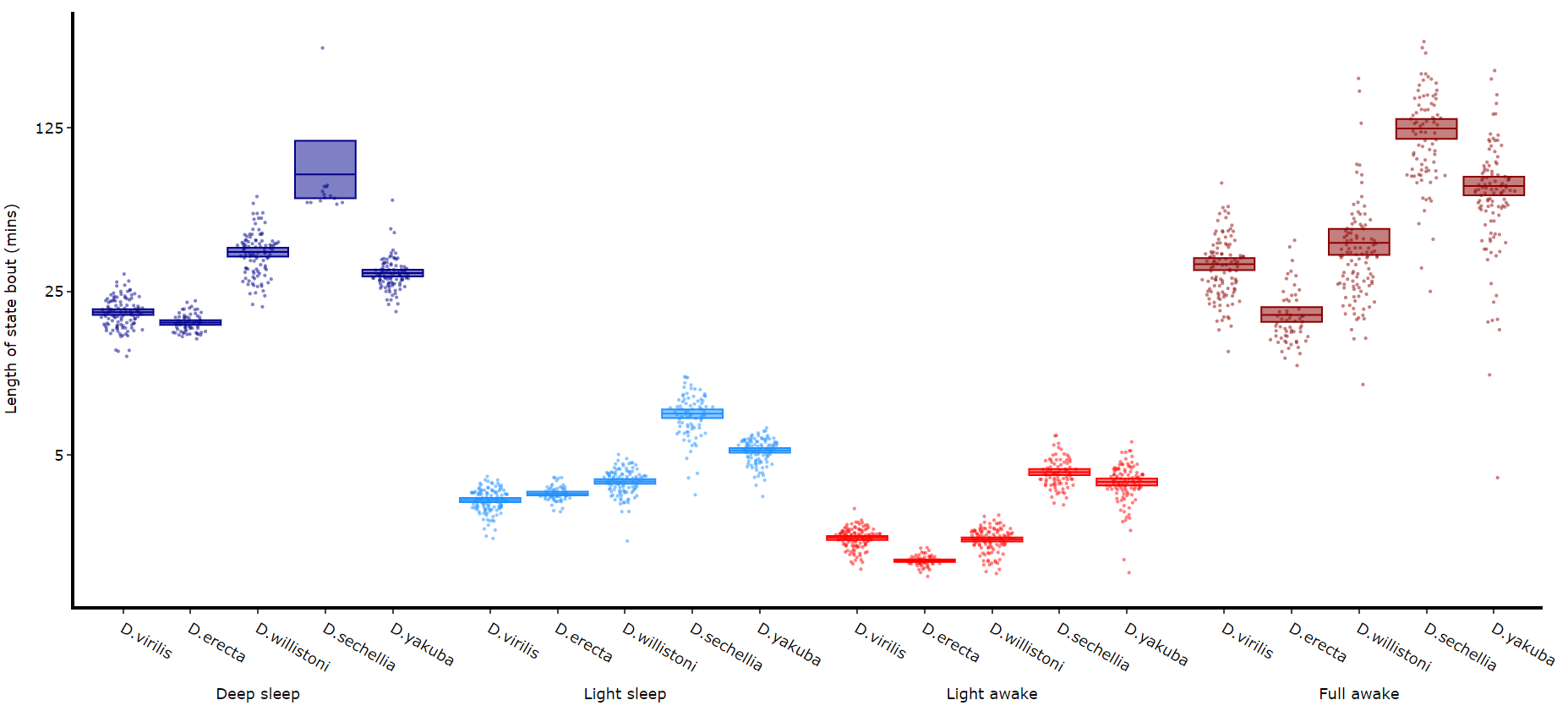
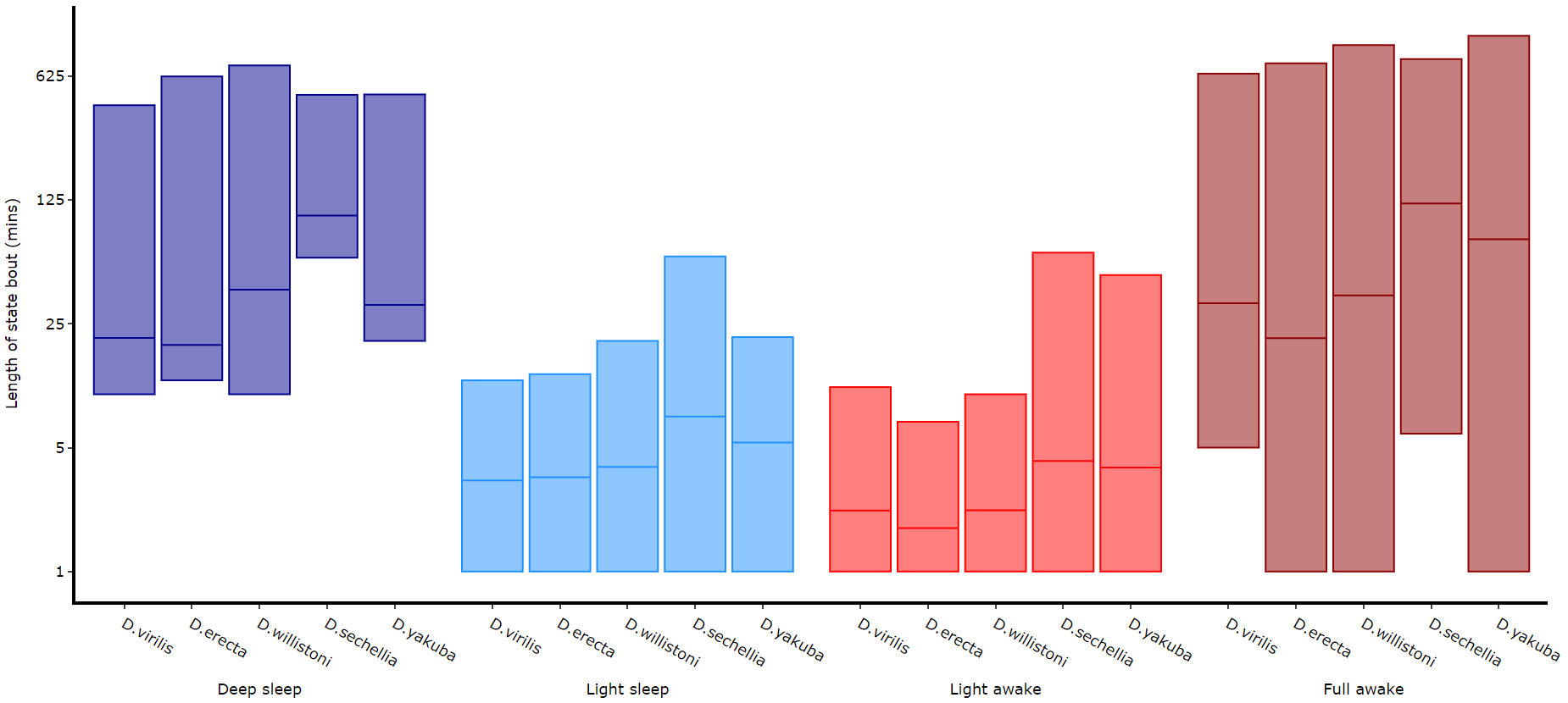
Its a good idea to look at the length of each state to gain an understanding of how the model is separating your data. There are two length methods 1) one to plot the mean lengths per state per specimen and 2) a plot to show the maximum and minimum state length per group.
# all hmm quantifying plots have the same parameters, so just change the method name and you're good to go

fig = df.plot_hmm_quantify_length(
    hmm = [hv, he, hw, hs, hy],
    variable = 'moving',
    facet_labels = ['D.virilis', 'D.erecta', 'D.willistoni', 'D.sechellia', 'D.yakuba']
    facet_col = 'species',
    facet_arg = ['D.vir', 'D.ere', 'D.wil', 'D.sec', 'D.yak'],
    bin = [60, 60, 60, 60, 60]
)
fig.show()
# The length min/max method only shows the the min and maximum points as a box
fig = df.plot_hmm_quantify_length_min_max(
hmm = [hv, he, hw, hs, hy],
variable = 'moving',
facet_labels = ['D.virilis', 'D.erecta', 'D.willistoni', 'D.sechellia', 'D.yakuba']
facet_col = 'species',
facet_arg = ['D.vir', 'D.ere', 'D.wil', 'D.sec', 'D.yak'],
bin = [60, 60, 60, 60, 60]
)
fig.show()
# Below you can see when the model seperates light sleep from deep sleep Quantifying transitions
The time in each state and the average length are good overview stats, but can be misleading about how often a state occurs if the state is short. This next method quantifies the amount of times a state is transitioned into, effectively counting the instances of the state regardless of time.
fig = df.plot_hmm_quantify_transition(
    hmm = [hv, he, hw, hs, hy],
    variable = 'moving',
    facet_labels = ['D.virilis', 'D.erecta', 'D.willistoni', 'D.sechellia', 'D.yakuba']
    facet_col = 'species',
    facet_arg = ['D.vir', 'D.ere', 'D.wil', 'D.sec', 'D.yak'],
    bin = [60, 60, 60, 60, 60]
)
fig.show()
Raw decoded plot
Sometimes you will want to view the raw decoded plots of individual specimens to get a sense of the daily ebb and flow. .plot_hmm_raw() will plot 1 or more individual specimens decoded sequences.
# The ID of each specimen will be printed to the screen in case you want o investigate one or som further
fig = df.plot_hmm_raw(
    hmm = h,
    variable = 'moving',
    num_plots = 5, # the number of different specimens you want in the plot
    bin = 60,
    title = ''
)
fig.show()

# Addtionally, if you have response data from mAGO experiments you can add that behavpy dataframe to
# highlight points of interaction and their response
# Purple = response, lime = no response
## df.plot_hmm_raw(mago_df = mdf, hmm = h, variable = 'moving', num_plots = 5, bin = 60, title = '', save = False)
